Optavia
Identity Refresh
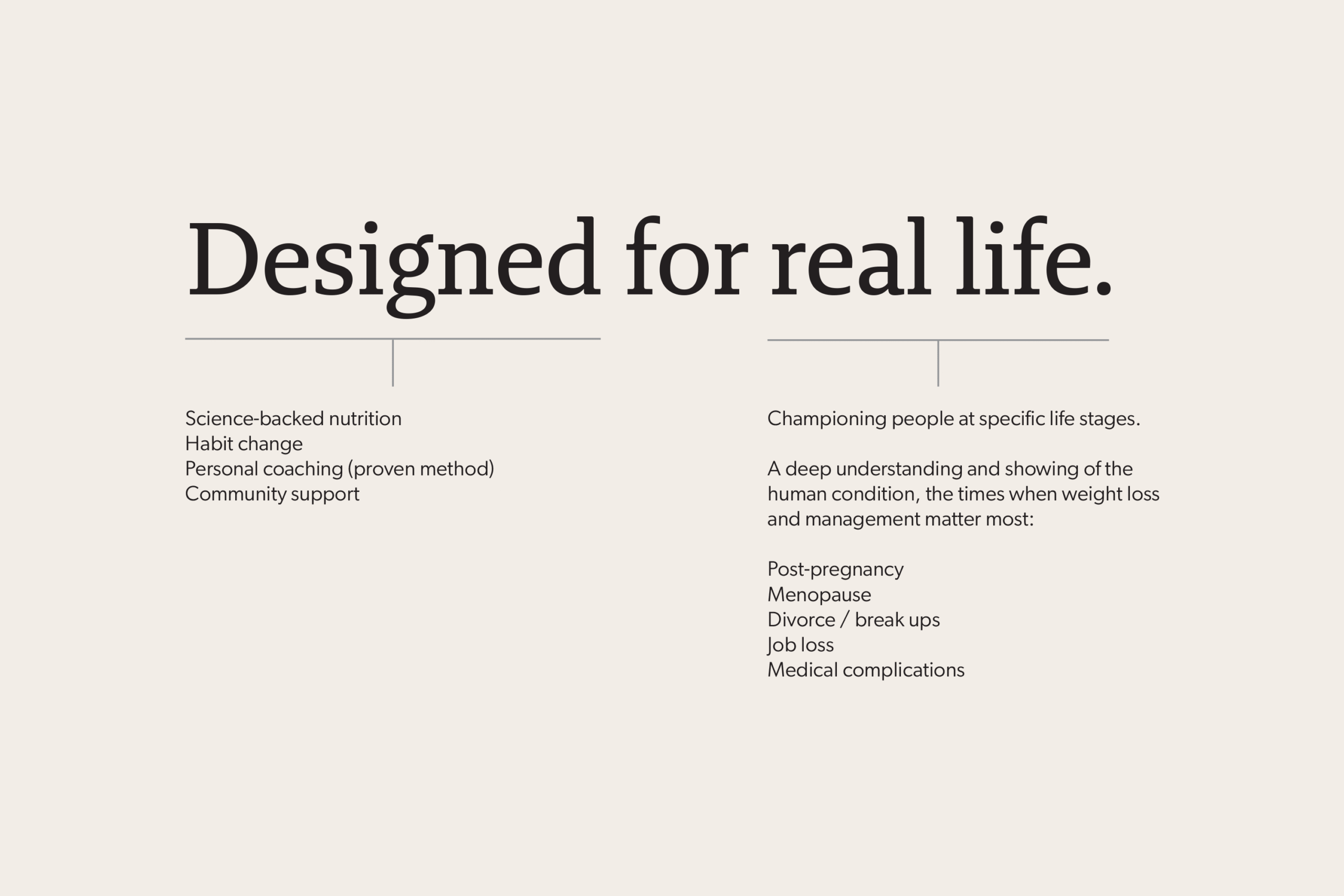
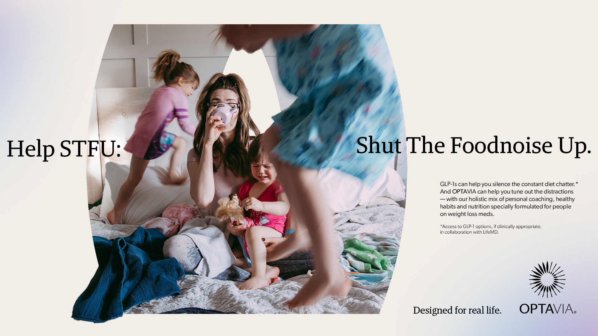
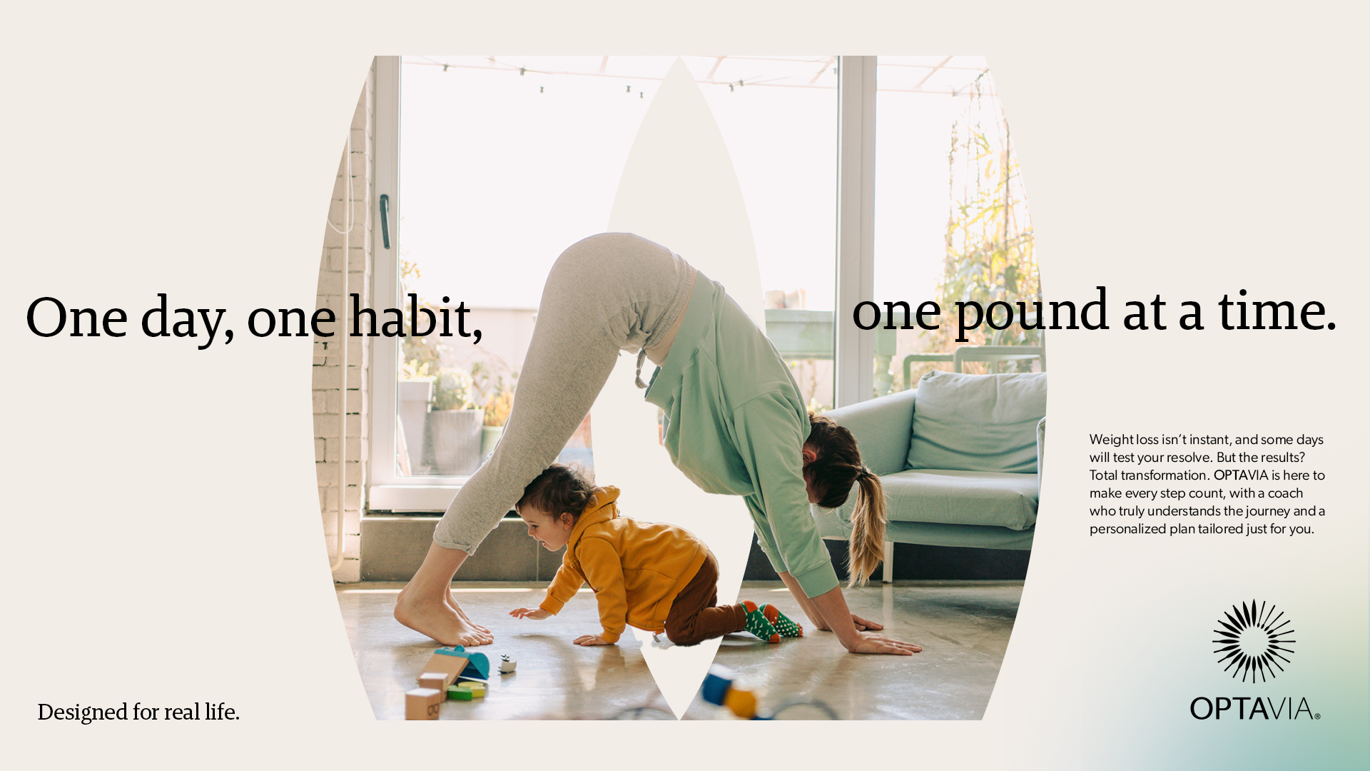
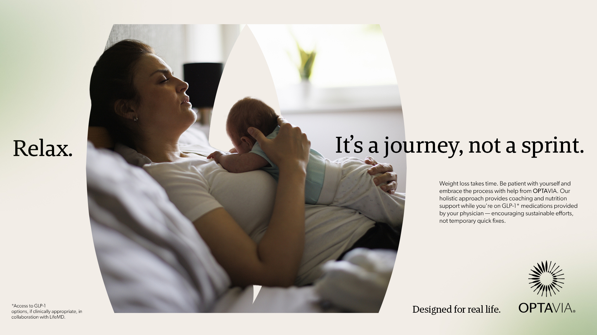
Optavia is dedicated to helping people on their weight-loss journey through coaching, supportive communities, and science-backed plans and products. We modernized their brand with a refreshing visual identity that expresses humanity, freedom, and limitless possibilites. I developed the look with new fonts, updated layouts and colors, and a bespoke brand element.
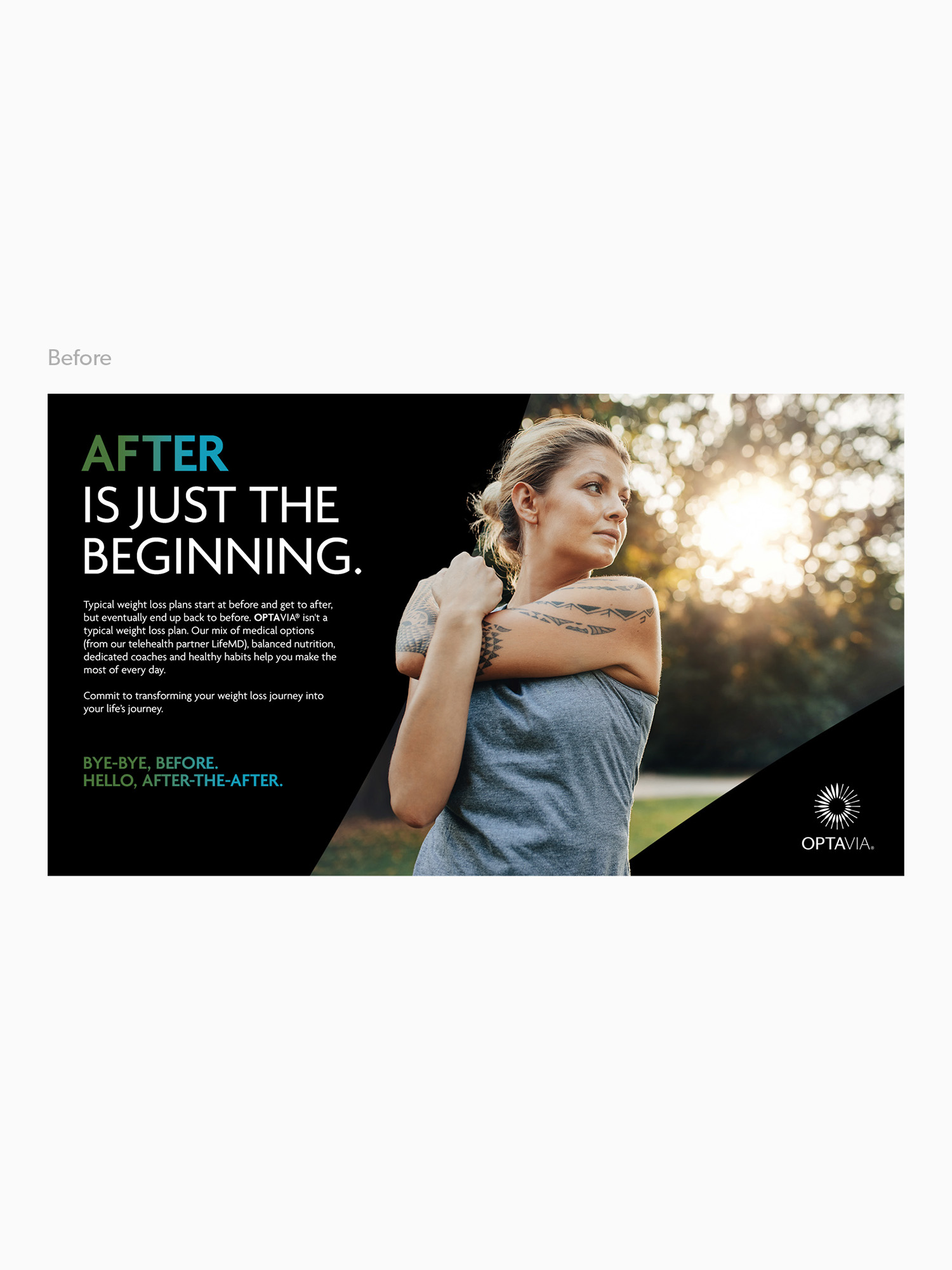
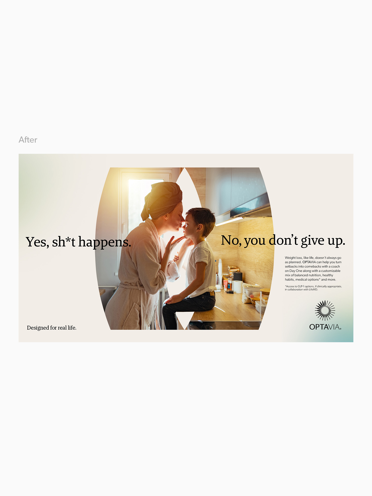
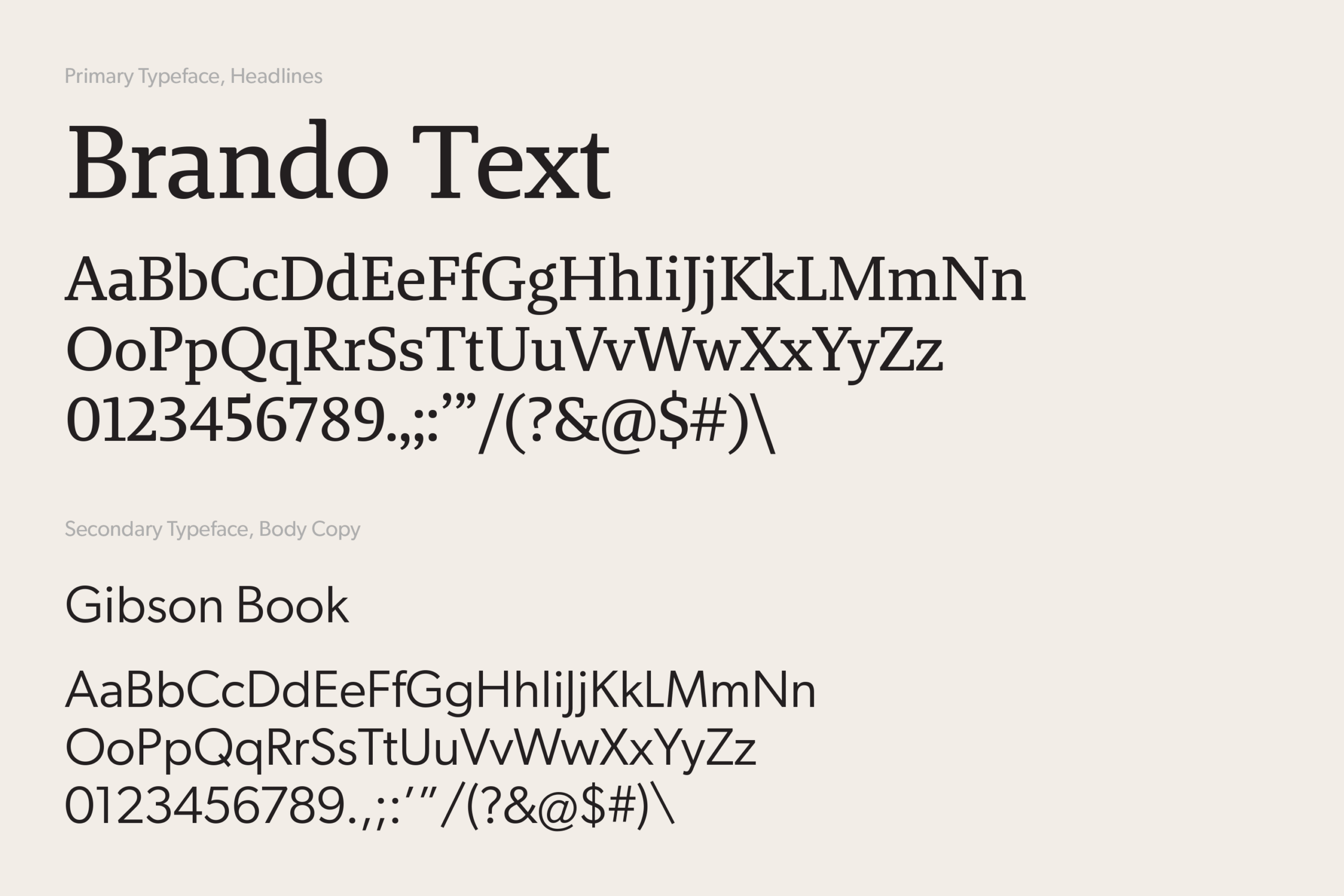
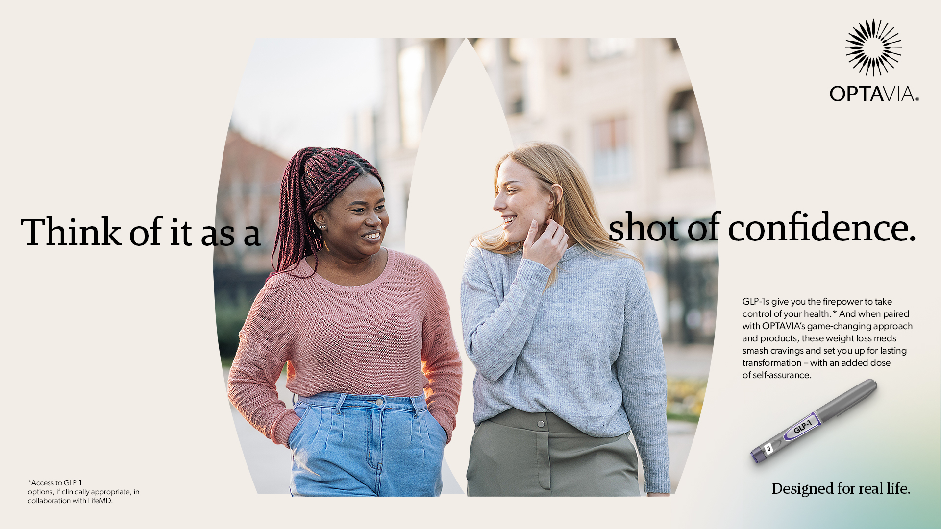
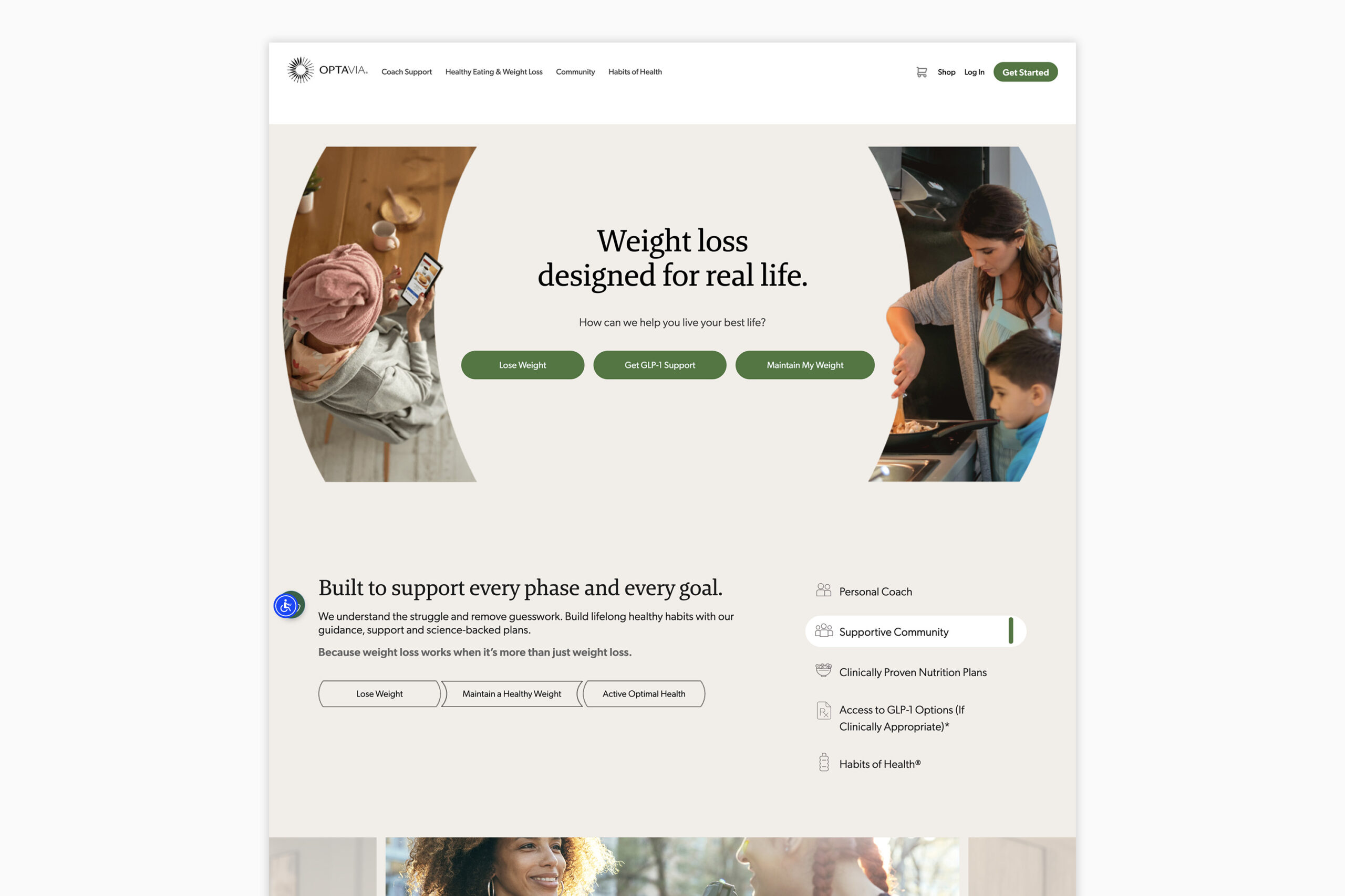
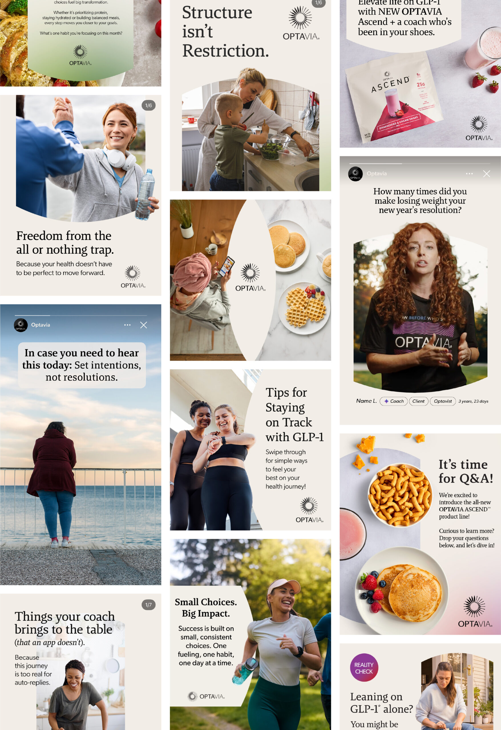
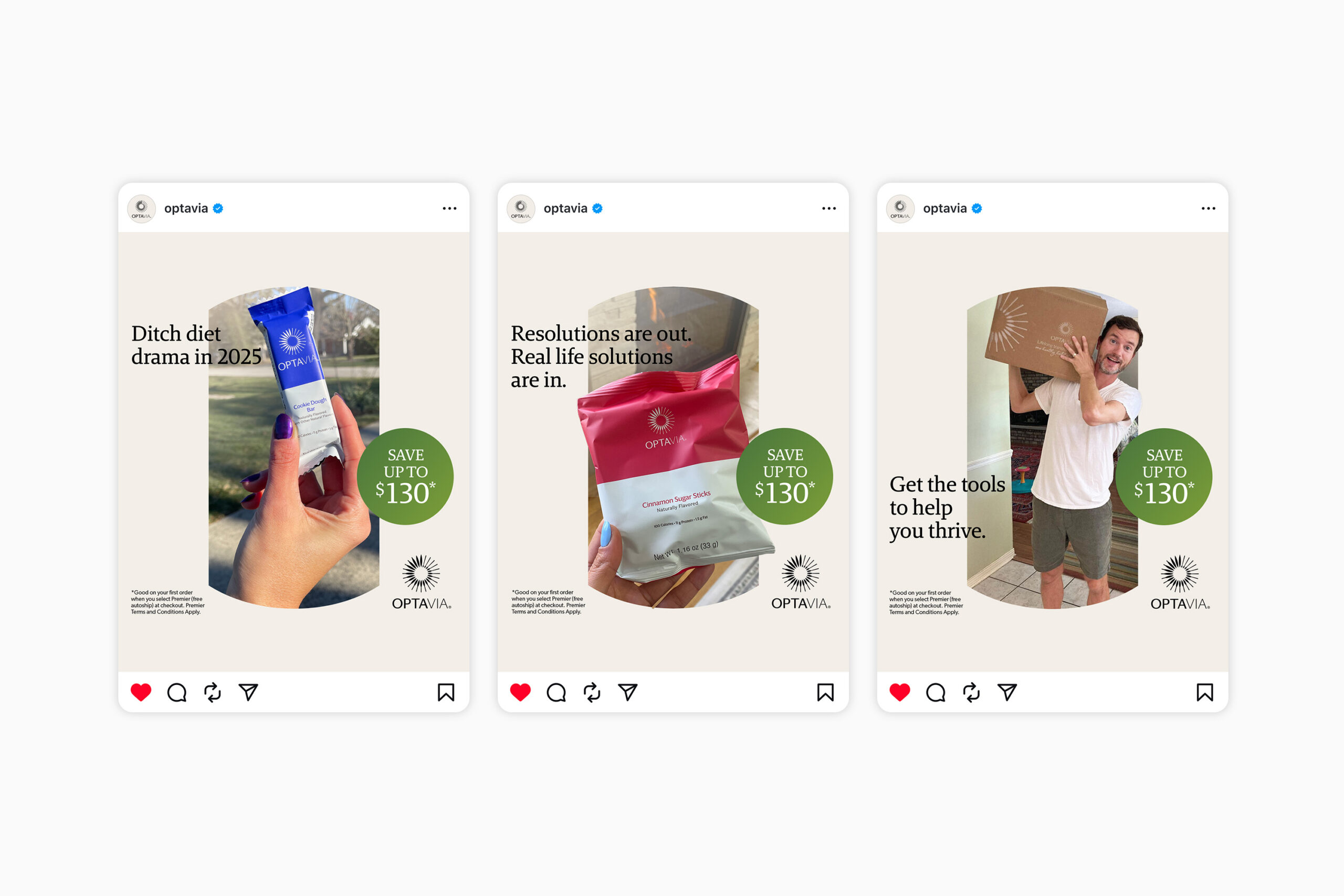
To humanize the brand, I swapped the once harsh geometric typeface for a softer, friendlier serif. The type size and weight are intentionally restrained to evoke quiet confidence and calmness.
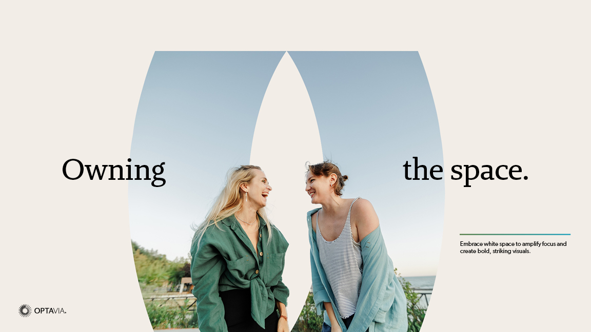
Another addition was the introduction of Ivory White. It's warm but airy and freeing compared to the once dark and serious look. Gradient accents using the original brand palette appear in the corners to subtly enhance the overall energy and vibrance.
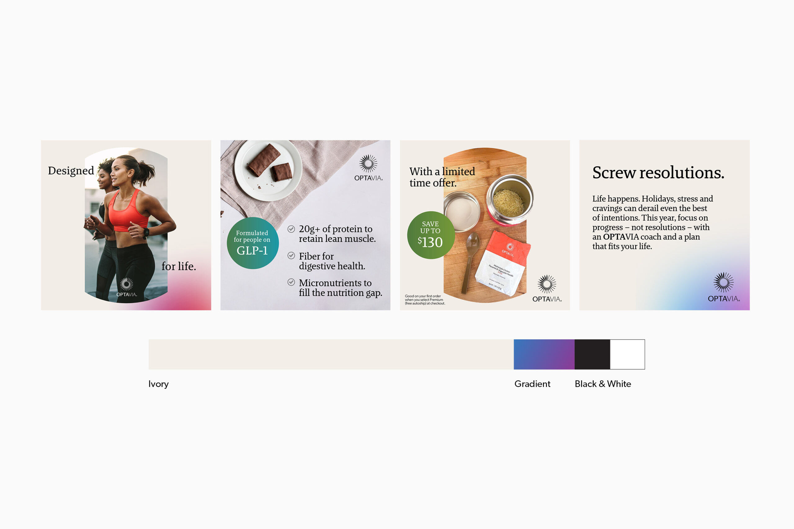
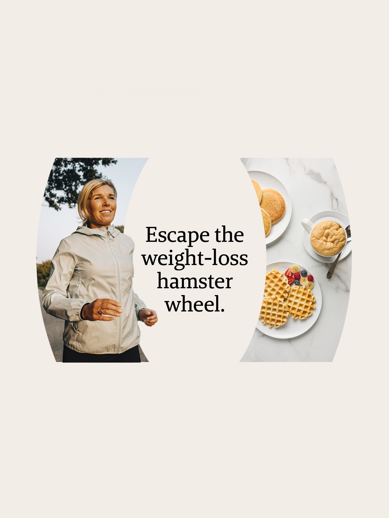
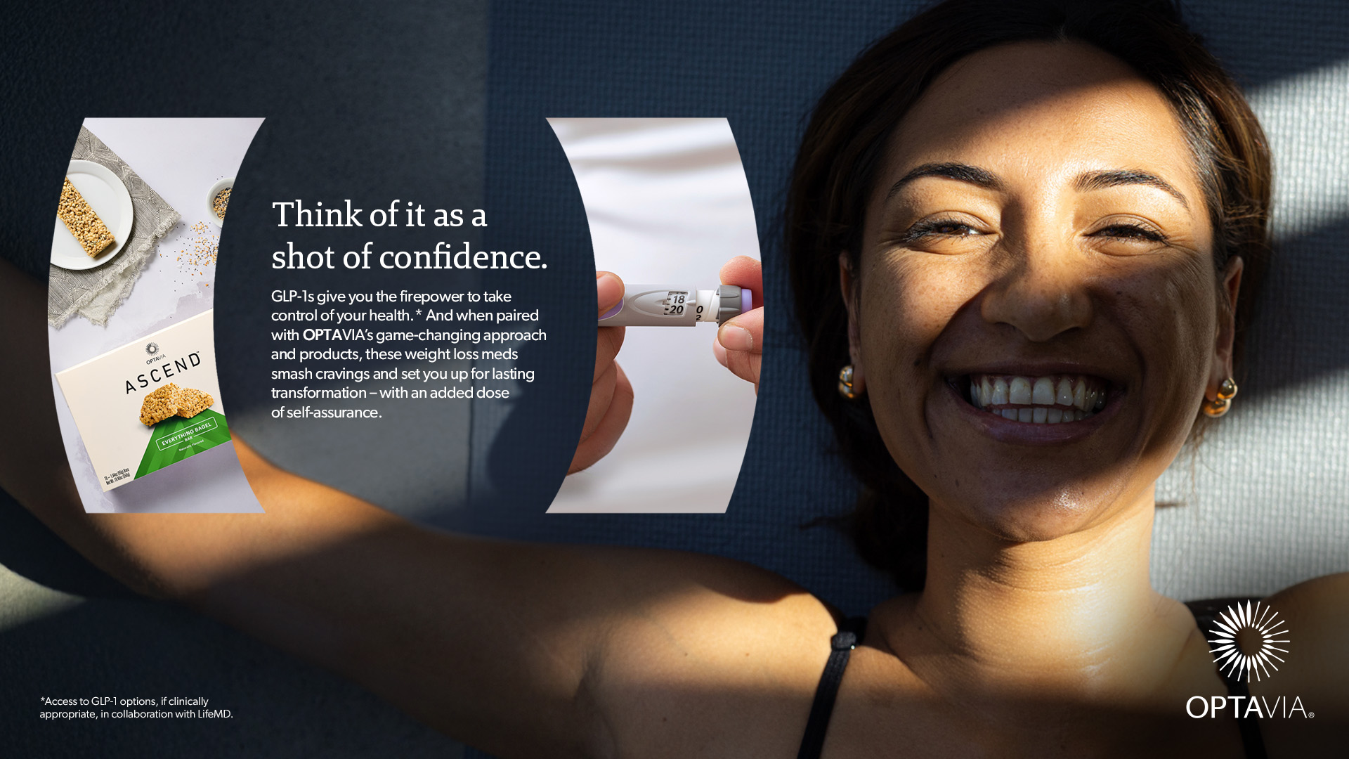
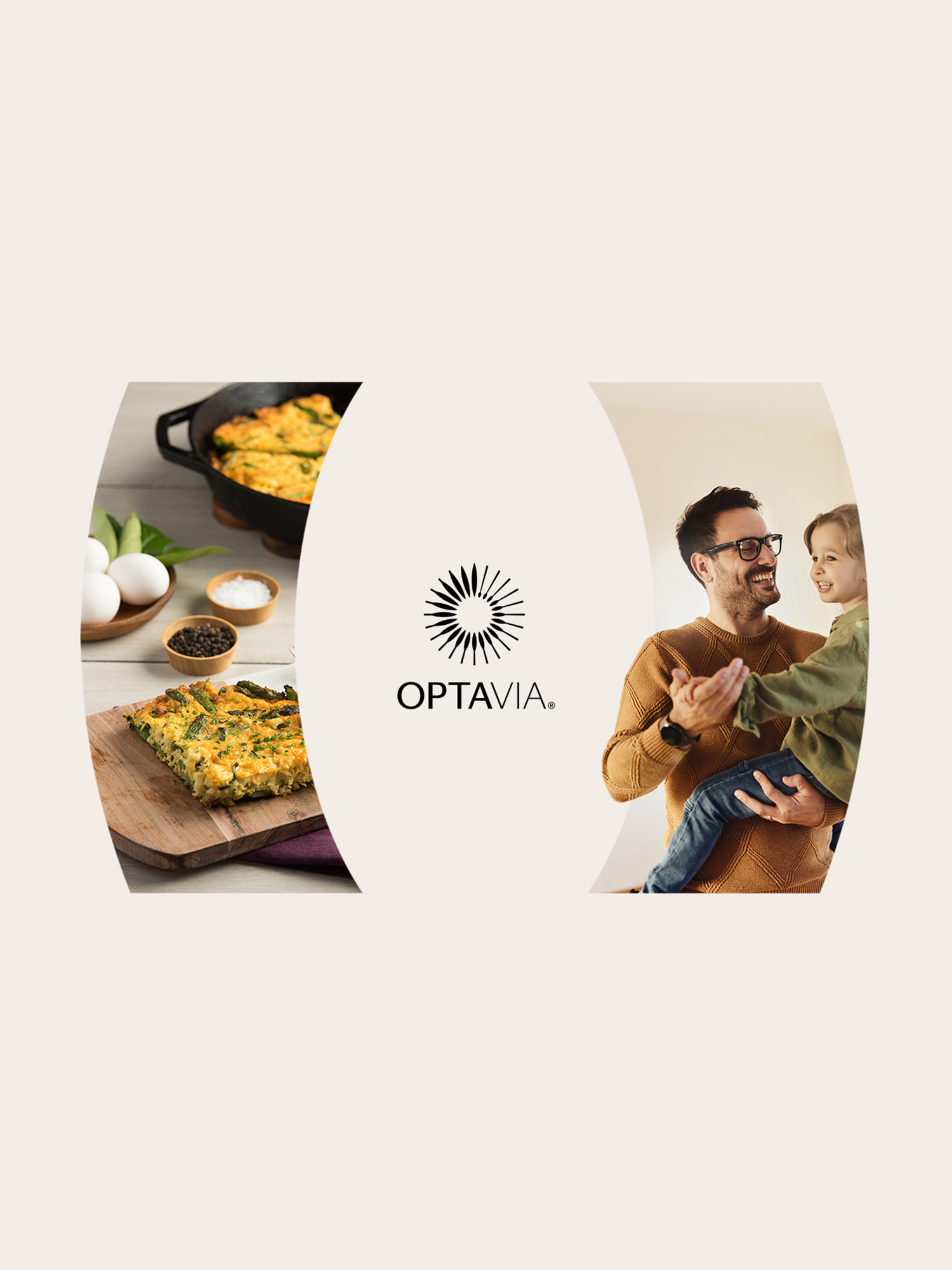
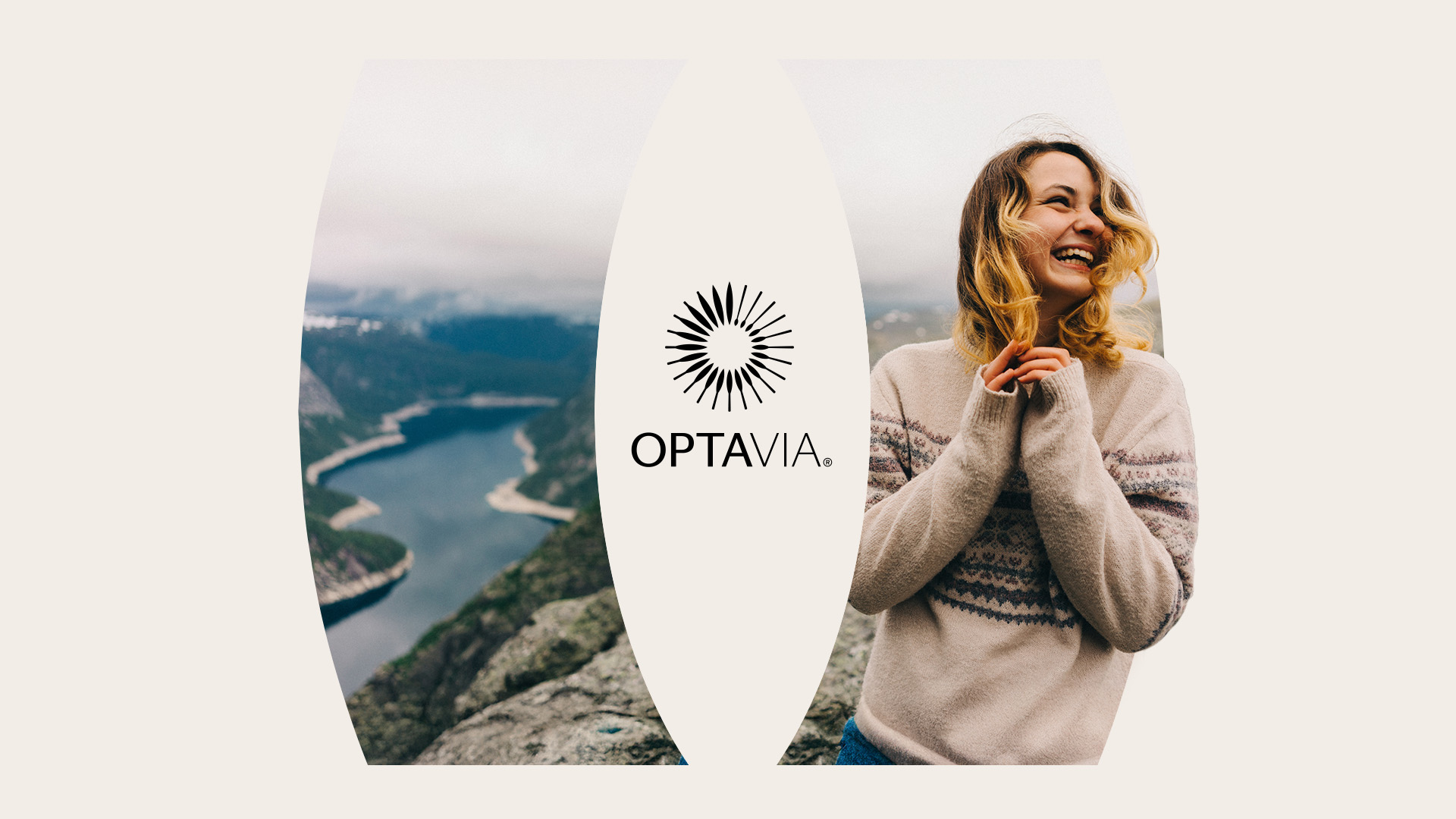
From the logo, I devised a new holding shape that offers an endlessly flexible system and is uniquely ownable by the brand. It can highlight key moments with multiple images, split apart to house logos and headlines, or showcase heroes and their stories in vertical, square, and horizontal frames.

Credits
Creative Directors
Designer
Carolyn Frank, Shawn Shields
Darren Wong